As a homeowner, you’re faced with the exciting challenge of turning a house into a home – one that truly fits your style and where you feel content to spend time. Even the smallest of spaces should serve a purpose; however, ensuring they accommodate your desires requires a bit of creativity.
On the surface, it seems like a task demanding function over beauty. The need to make things fit can overshadow the potential for crafting a warm, inviting space. But hurdles are opportunities to get in tune with your creative side. And a willingness to think outside the box is sometimes all it takes to turn an uninspired, potentially awkward room into one that’s not only practical but completely your own.
If you’re reading this, you may have run into one of the many difficulties of maximizing small spaces, such as a lack of storage, an inconvenient layout, or square footage that just feels too cramped to work with.


The before + after of turning the garage into a multi-purpose space in our Dad Moves In Project – Design by Cottage & Key / Photography by Madeline Harper.
Small Space Solutions Anyone Can Achieve
Our hope is that after taking in these small space design tips, you’ll go from feeling defeated to motivated to make the most of whatever room you currently want to bring fresh energy into. Because in the end, it’s not about the physical space itself. It’s about quality – making the most of what you’ve got. Designing with an attitude of gratitude helps keep the focus on connecting with the things you love, and even the people you love, within your personal surroundings.

Design and Photography by Cottage & Key
Make More Room to Move
If you’re starting with a lived-in space, such as a laundry room or guest room that doubles as storage, the first step is to declutter. It’s a good idea to revisit each room and storage space every six months to take inventory of what’s ended up there in the midst of everyday life.
Even if you feel like you have a good sense of what’s currently hiding in every nook and cranny, take a look around. Sift through closets, boxes, and drawers; peek under beds, grab a step ladder, and check out that top shelf.
As you do, ask yourself these questions:
- Do I want/need to keep this? What’s its purpose? Can it go?
- Does this need to be stored in this room/area of my home? Is this the best place for it?
- What’s throwing me off as I walk through the door? Are there objects or furniture pieces here that disrupt the flow or aren’t functioning as intended, such as an oversized chair that takes up a big corner of the room but only provides one seat? What about visually? Is there décor that no longer fits my intended (and preferred) aesthetic?
You might be surprised at just how much “past you” has held onto while taking inventory of what covers every inch of your work-in-progress space! As difficult as it can be at times, letting go is how you make way for something better – like feeling truly content and comfortable when spending time in the place you call “home.”
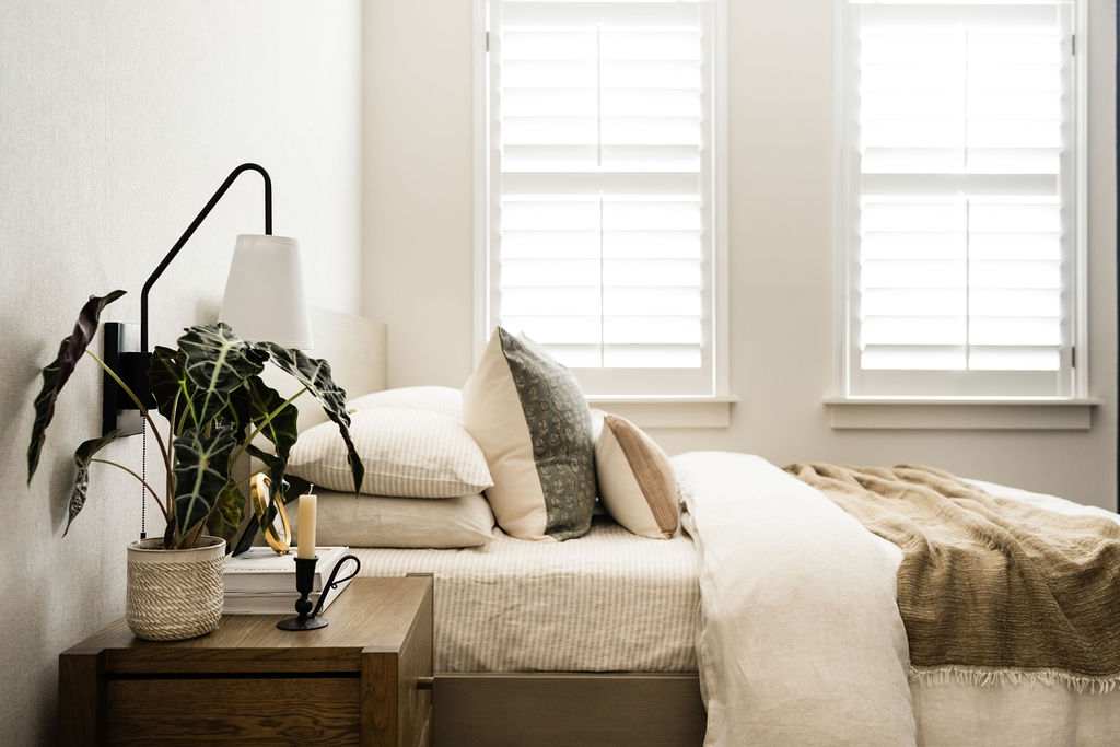
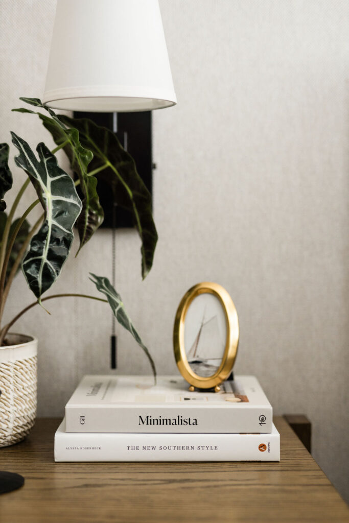
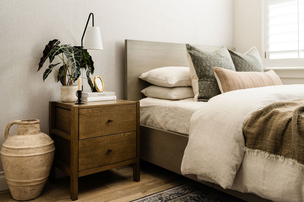
Design by Cottage & Key / Photography by Madeline Harper.
Incorporate Multipurpose Pieces & Storage Solutions
One of our favorite ways to maximize small spaces is with multifunctional furniture, appliances, and décor. Almost all types of furniture can double as a storage solution — from storage ottomans to sectionals with under-cushion storage to bed frames with pull-out drawers. You might even opt for an accent chair and ottoman set that allows you to tuck away the ottoman when you need to make some extra room, then pull it back out for an extra seat or surface. And nesting tables? They can add a little flair without hogging precious floor real estate, all while giving you a bonus (mini) dining and entertaining space in a pinch.
In our Dad Moves In project, we even went as far as incorporating a new appliance in the kitchen – a sink and dishwasher combo! With its modern design and multifaceted functionality, it redefines small space living, making every square inch count.
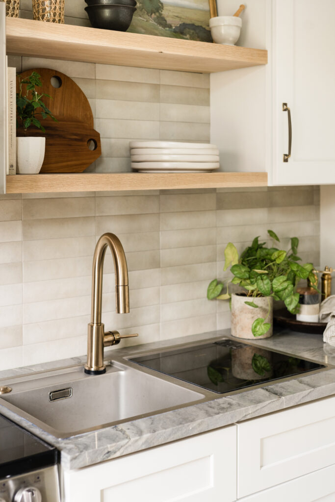

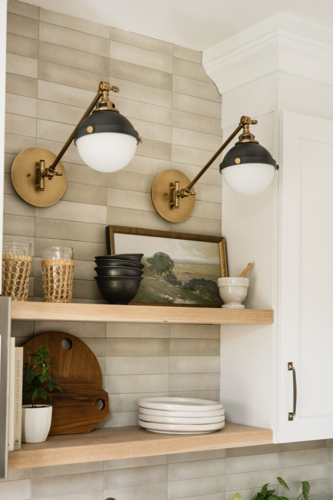
Design by Cottage & Key / Photography by Madeline Harper.
When making the most of the space, some of our favorite storage solutions – beyond what we’ve already mentioned – include consoles, medicine cabinets in bathrooms, and long niches in showers.
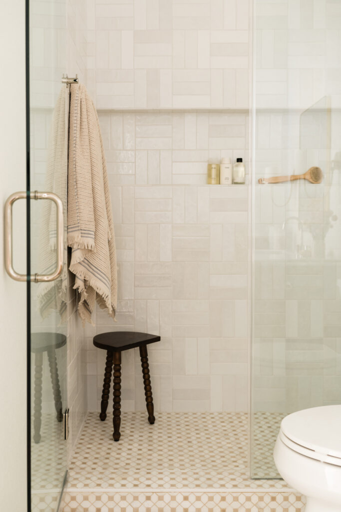
Design by Cottage & Key / Photography by Madeline Harper.
A note on furniture: getting the right size is key. Go too big, and you’ll feel cramped. But if it’s too small, your space might look like it’s missing something (definitely not what we’re going for – no one wants their family room to scream “dorm life”). Now, when it comes to furniture with built-in storage, it can naturally be more bulky. So to balance it out, opt for pieces that have a smaller footprint, like slim and sleek tables or floor lamps, and furniture with legs to add height and a sense of lightness to the room.
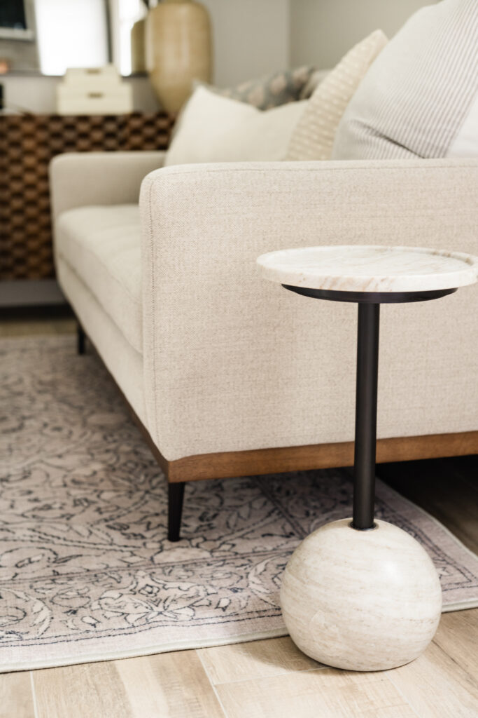
Design by Cottage & Key / Photography by Madeline Harper.
Lighten It Up
We’re sure you’ve heard it from us before, but it’s worth repeating: natural light is your best friend – no matter the size of the room you’re working with. But we know that many small spaces such as bathrooms, dens, and basements are often lacking. To make up for the lack of a sunny glow, we recommend soft, layered lighting to add warmth.
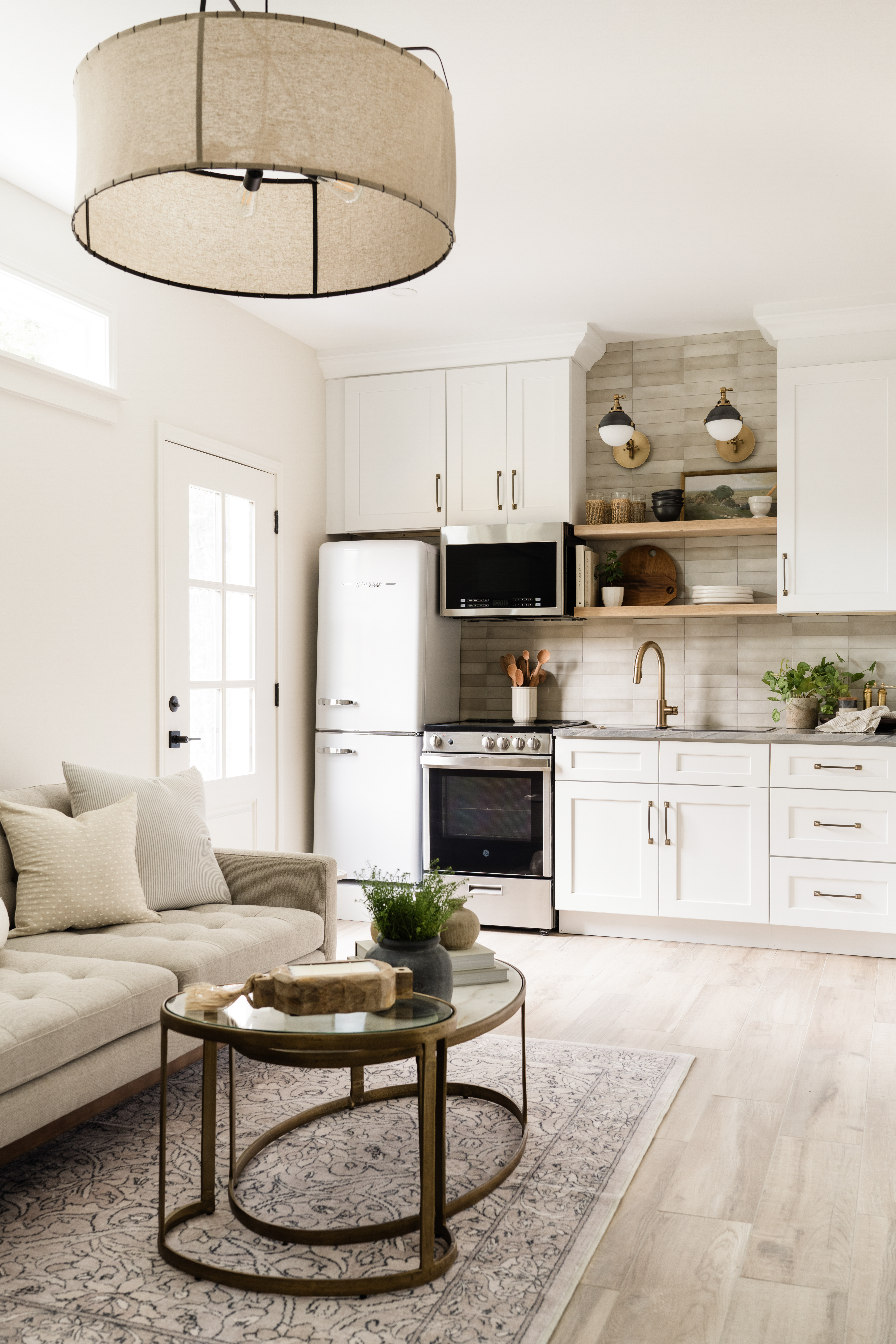
For example, in our Dad Moves In project, we turned half of a two-car garage into a livable space. Given its intended use, it was naturally devoid of light. Layered lighting with wall sconces, an overhead light, recessed lights, and a table lamp allowed for setting different moods, giving it a cozy feel. While not always possible, we added to the structure with the addition of a front door and two picture windows above the sofa, highlighting the 9’ ceiling.
If an area doesn’t have enough built-in lighting and you don’t want to deal with the hassle of rewiring, opt for wire-free options like battery-operated sconces. They’ll definitely help brighten things up in no time!
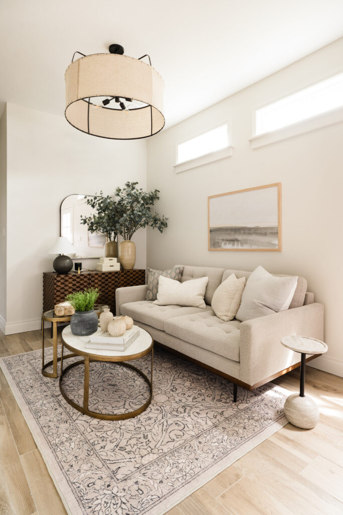
Design by Cottage & Key / Photography by Madeline Harper.
Use Paint to Your Advantage
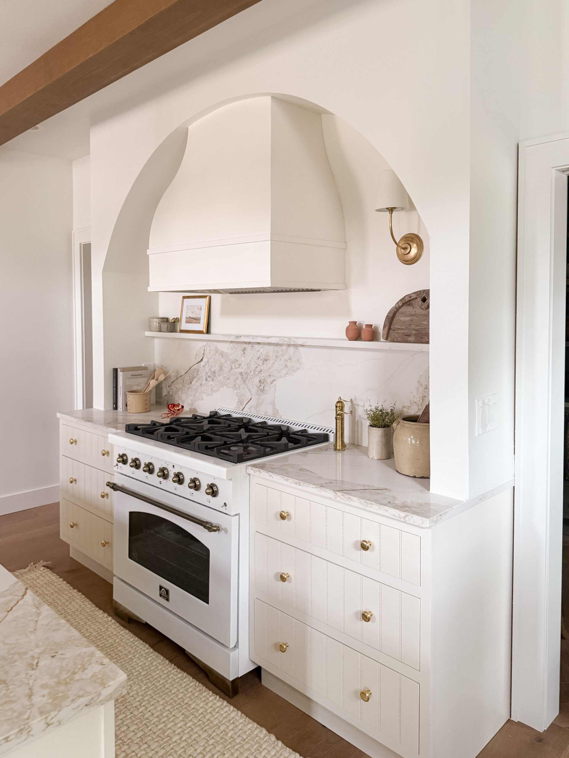
It’s true that paint can have a major impact on how light and airy a room feels, and this is even more important in one that doesn’t already have a ton of natural light pouring in. So here’s the key: go for a light neutral for the walls and consider extending the color on the ceiling. It’ll keep things feeling cohesive and give the illusion of more space!
But this doesn’t mean you have to forgo pops of color. Like a bit of drama? Go for it with darker toned accents if you’re into that look. Whatever you do, think vertical when possible. Whether it’s a cool accent wall with built panels/trim molding or wallpaper, anything that draws the eye upward adds depth without cramping your style.
In our Nestled in Austin project, you can see we introduced a beautiful deep blue to the cabinetry to stand out against the surrounding warm whites and wood tones. It’s all about playing with light and dark to keep things lively and intriguing!

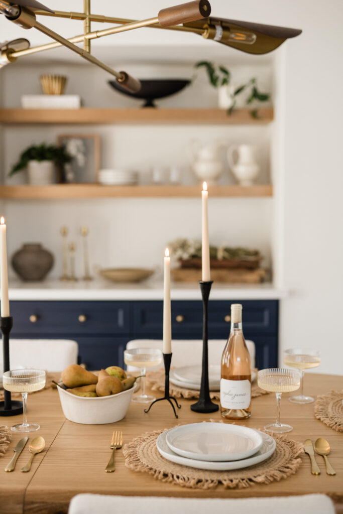

Design by Cottage & Key / Photography by Madeline Harper.
Establish a Functional Flow with Defined Zones
Sure, open-concept layouts can help expand a small space. But defined zones will make it more functional – much like interior walls would. Think of it as giving each part of the room a job to do. One way to accomplish this is by adding natural boundaries through thoughtful furniture layouts and area rugs. You can even establish defined zones on a smaller scale by utilizing storage vessels and trays. Just another way to keep things tidy and assign each little nook its own purpose within shelving or on tables. Make your space work for you!
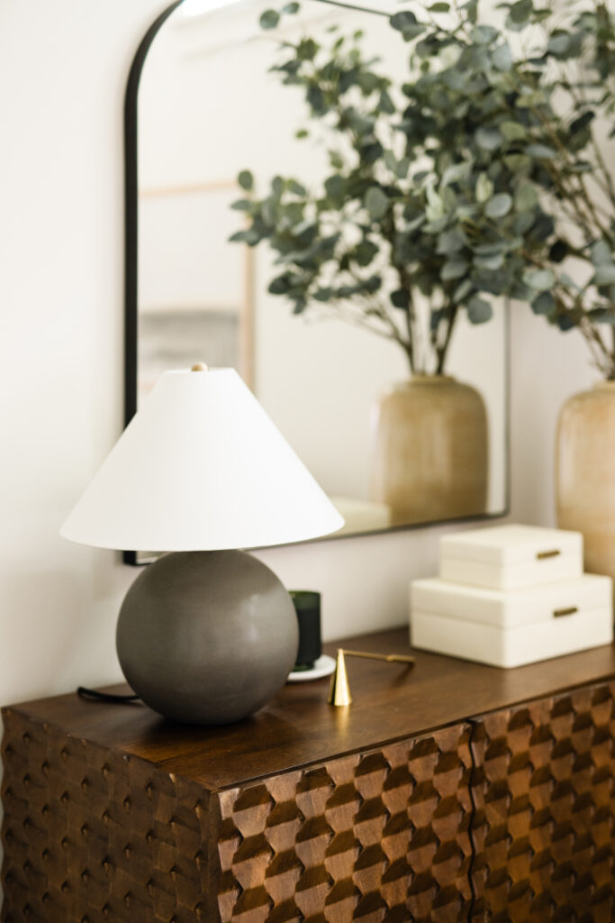
Design by Cottage & Key / Photography by Madeline Harper.
Add Personality & Visual Interest
It might seem counterintuitive to put decorative objects out when you don’t have much room to work with. Instead, you’re probably more tempted to eliminate décor or stash items behind cabinets to avoid unnecessary clutter. But successfully designing for a small space doesn’t have to equate to limiting your creativity or even hiding everything you own! In fact, we’re all for adding a bit of personality through thoughtful styling.

Design by Cottage & Key / Photography by Madeline Harper.
Creating a cozy, collected feel without cramping your space is an art and a science. So here’s something you can try out: display your curated collection on floating shelves, in built-in cabinets, or using wall hooks. (We say curated because you should have a carefully selected assortment after combing through any clutter to make more room to move – tip #1!). As an added benefit, being able to see most pieces in a room naturally helps you avoid mindlessly piling up items in a closet that you may forget about and never use.
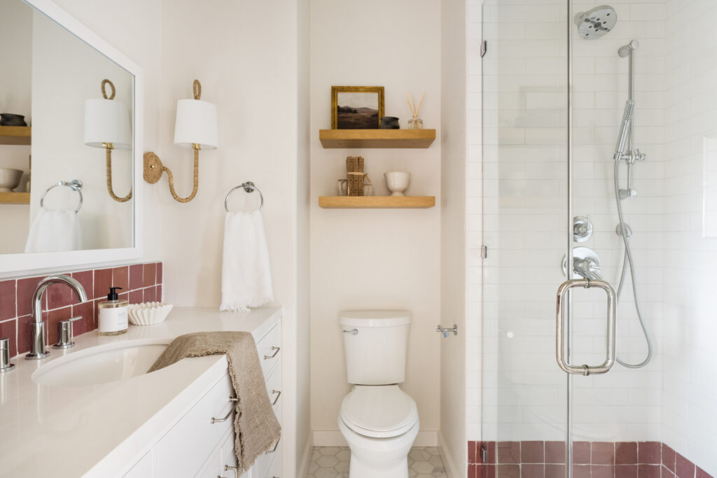
Design by Cottage & Key / Photography by Madeline Harper.
Of course, there are plenty of other ways to create visual interest. Another favorite of ours? Incorporating mirrors, which can serve a dual purpose. Beyond the looks of it, a mirror can make your place appear larger by bouncing light around and adding some depth.
And once again: use that vertical space wisely. Think tall furniture pieces that draw the eye up and other decorative accents. In our Dad Moves In project, textured linen wallpaper, Roman clay application, and receded white oak cabinets gave the former garage some welcome charm without adding to its footprint.
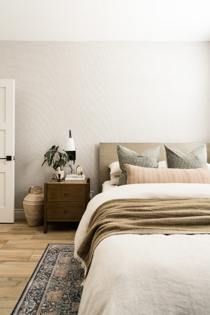
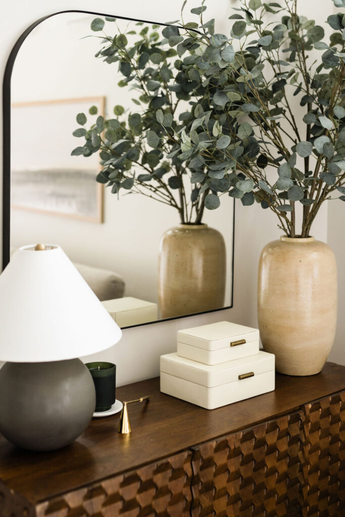
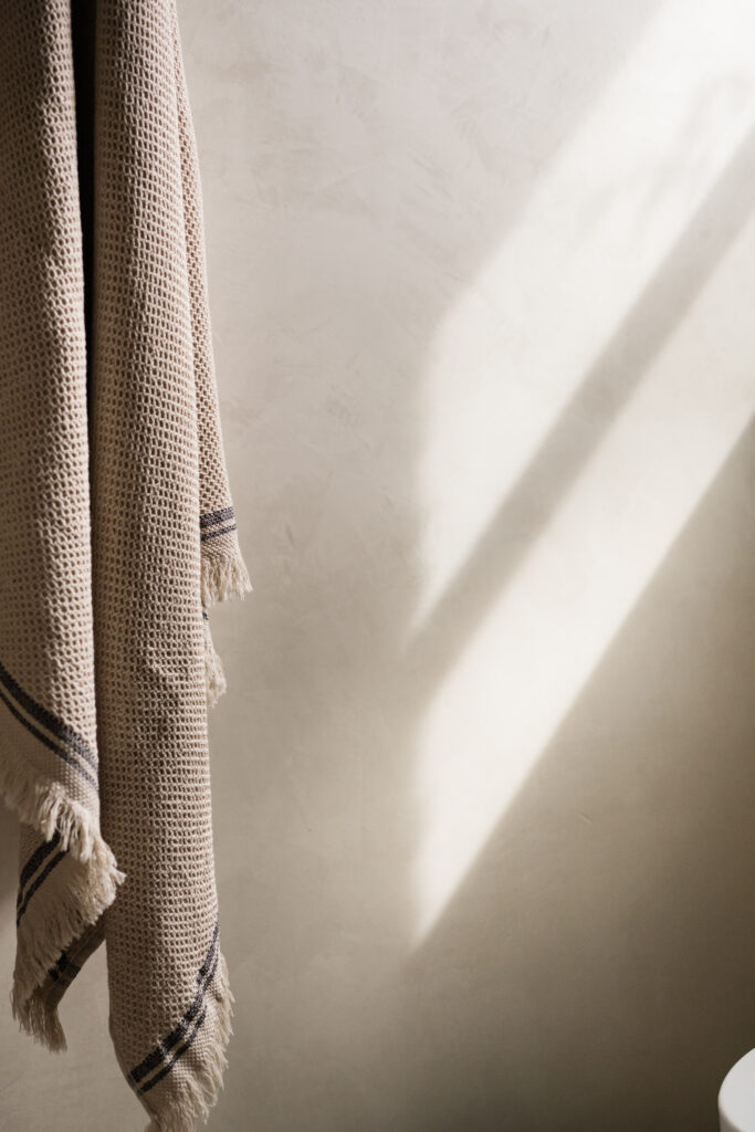
Design by Cottage & Key / Photography by Madeline Harper.
Bringing It All Together
As designers, we always strive to make sure every single thing in your home serves a purpose, whether literally (in how you use it) or figuratively (in how it makes you feel). Better yet if it achieves both!
When it comes to small space design, that’s even more important. You have to really think about what you’re bringing to the room. Is it meaningful and functional?
At Cottage & Key, we’ve learned a thing or two about this because we got our start restoring old cottages into family homes. Our design studio knowledge and approach naturally extends into our shoppe. We’re all about handpicking pieces that are well-designed and well-crafted. If you stick to the idea of creating with intention, you can transform even the most challenging space into one that suits your every need.
We hope you’ll give these tips a try! But if you need an extra nudge, know that we live for turning challenges into creative opportunities. Get inspired by a few of our favorite small space solutions displayed within our collection of completed projects.
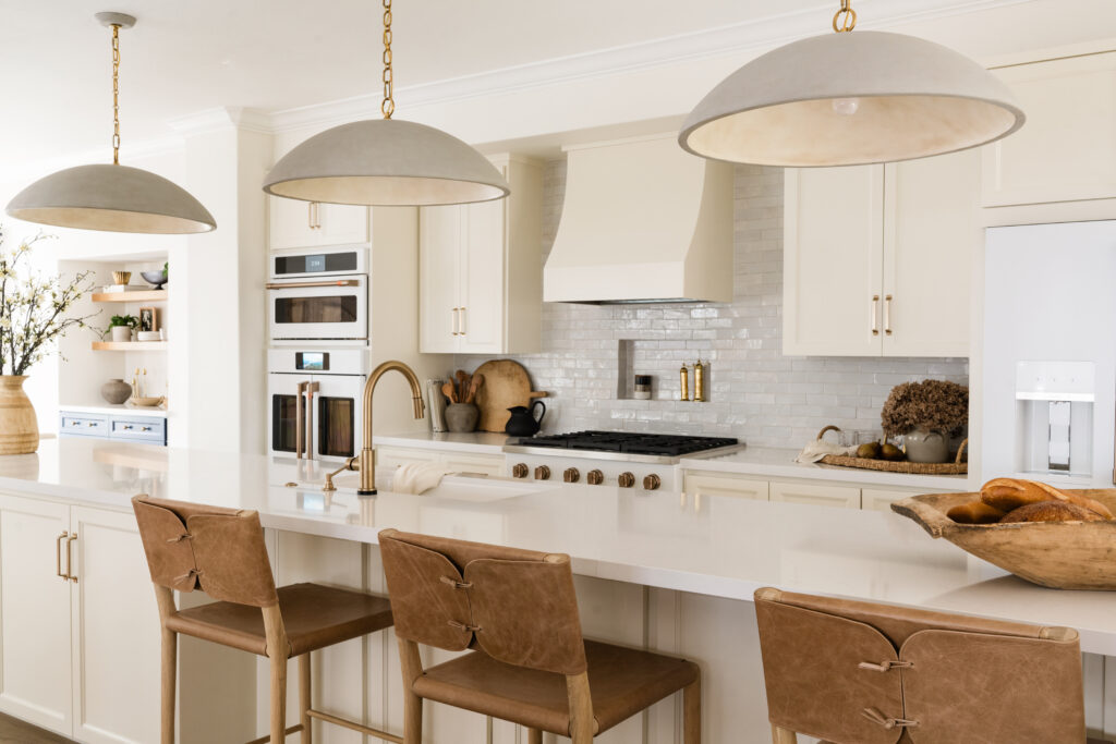
Design by Cottage & Key / Photography by Madeline Harper.
Lastly, if you’re looking for a team to lean on with small space design expertise, invite us in! Send a note today to schedule a complimentary 1:1 design discovery call. Here’s to living fully.
Read the Comments +